Orsetti Construction
Trevan Orsetti was looking to start up a brand new business, and knew that one of the first things that was needed was a solid reliable logo. So he came to me looking for something that was clean, architecturally focused, based around his last name "Orsetti" and to possibly have a color scheme of black and gold, beyond that it was free reign.
The problem for creating a logo like this is the vast array of options that are suddenly available. Narrowing down became priority number one. Thanks to sketches, word maps and some research three very different styles came to the front.


These three different styles I was able to develop in to some unfinished but workable versions of the logo. These three being very different in style from each other, I presented to Trevan, this would allow me to further define and refine the style that they were happy with.
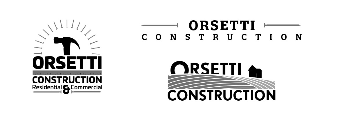
For different reasons two designs were rejected and Trevan was very happy with the one that ended up being refined into the final logo. After a few adjustments to help clean up and clarify the design we settled on the following:
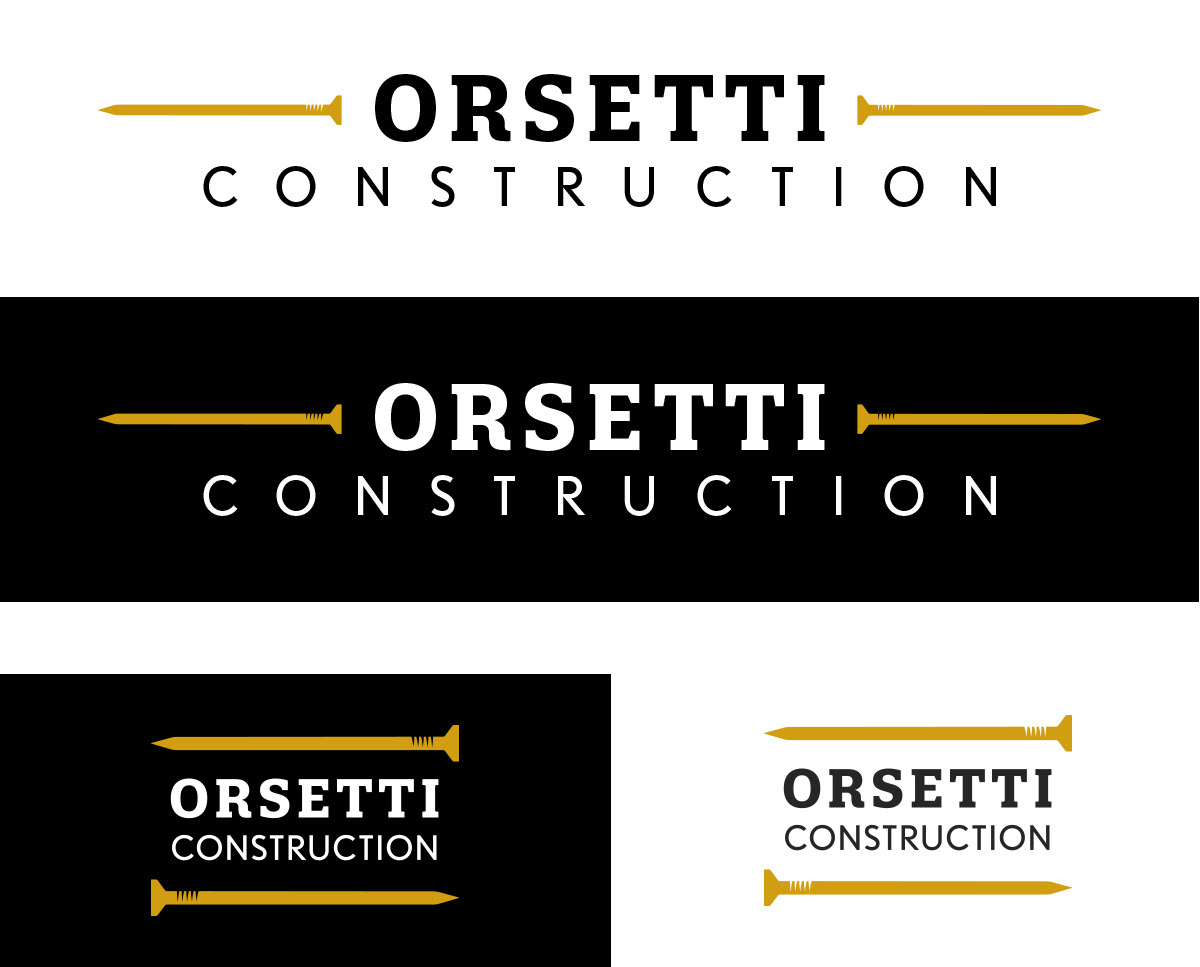
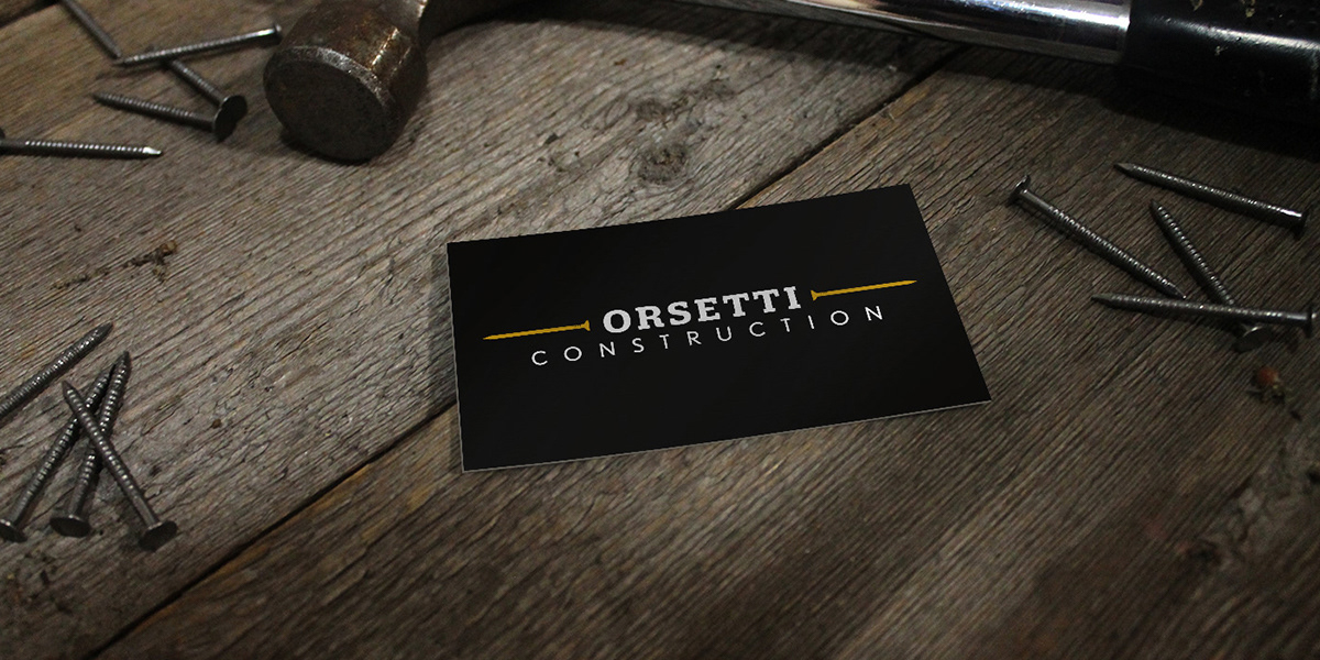
The end result is simple, solid, clear and concise, it will last the company a long time as they grow. Trevan was very happy with the results I look forward to seeing his company grow under this new logo.