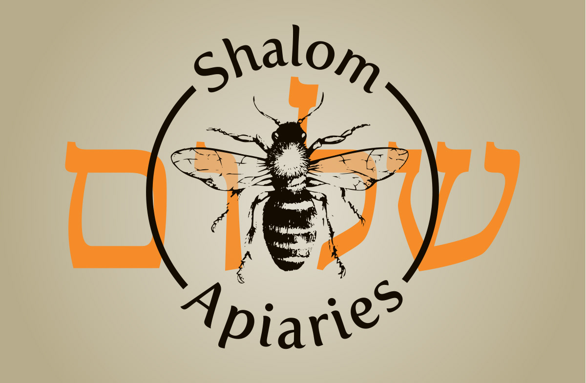
Tim came to me looking to take their business to the next step, something more professional and eye catching was requested, preferably with a bee that lands in the more photographic and realistic end of things than cartoon. Also the final touch was to add the Hebrew word "Shalom" to the logo in a way that meshed well.
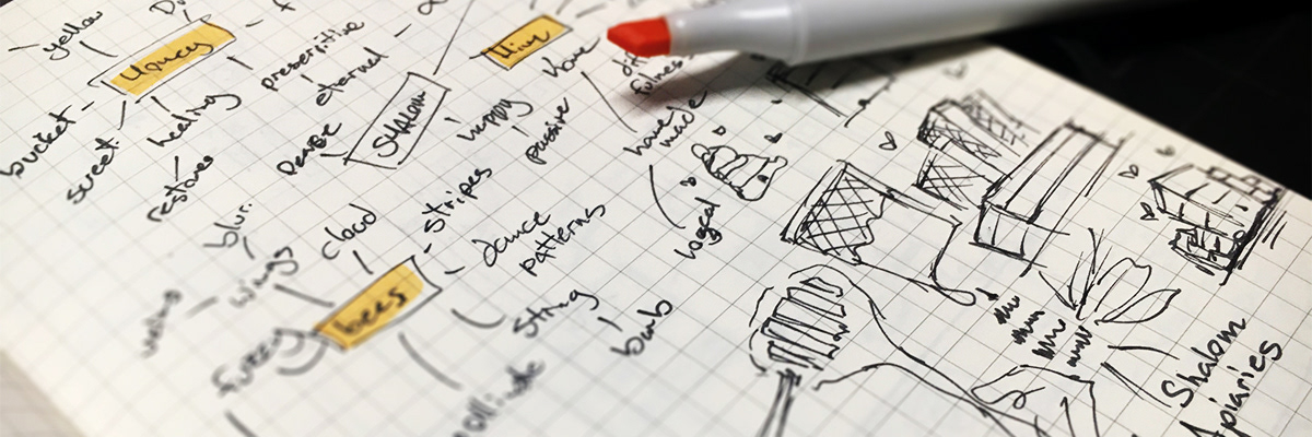
The difficulty arose mostly from working the Hebrew and English into the logo in a way that worked and looked natural. Both languages had to be legible and the fact that Hebrew runs right to left and English left to right, they had to balance somewhere in the middle. As for the rest of the logo, I didn't feel like a photograph is the best solution for a logo, it's too complicated and detailed, so I needed to simplify it without losing the realistic feel of the image.
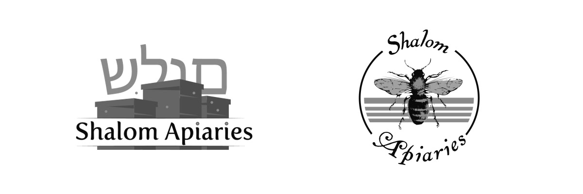
To solve the language problem I initially tried to stack the two on top of each other, and use size to separate them but they ended up conflicting. So I separated them, they are different in color, size, weight, shape and placement but they both encapsulate the central element of the bee joining them together but keeping them visually apart without the conflict.
As for the bee itself, I reference old scientific drawings, these are done in black and white, hand drawn and have a level of both simplicity and detail that was required for what I wanted to portray in this logo design.

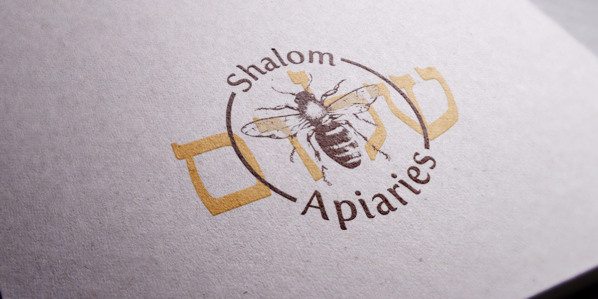
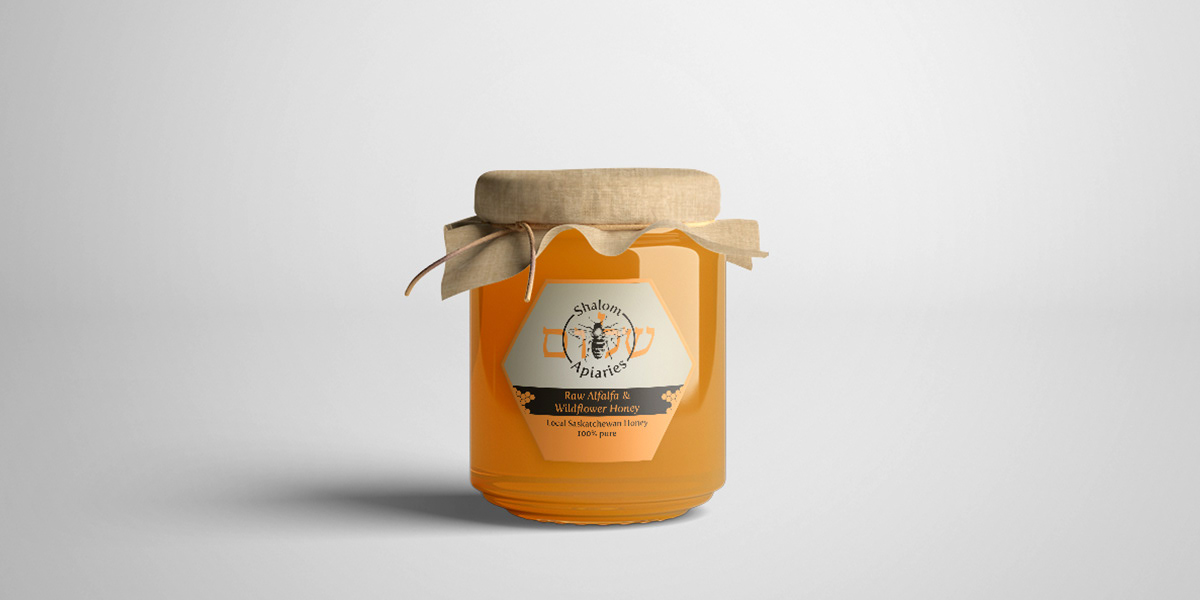
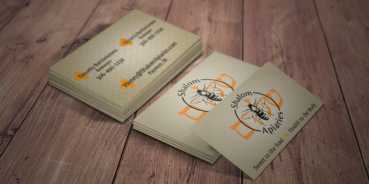
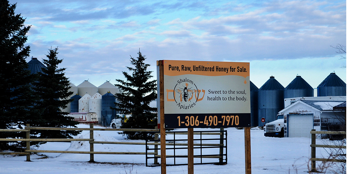
Along with the logo design I ended up producing labels, business cards, magnets, and large signage for the property as can be seen below. The logo lent itself well to all forms as I had planned and the end result is very solid and clear.