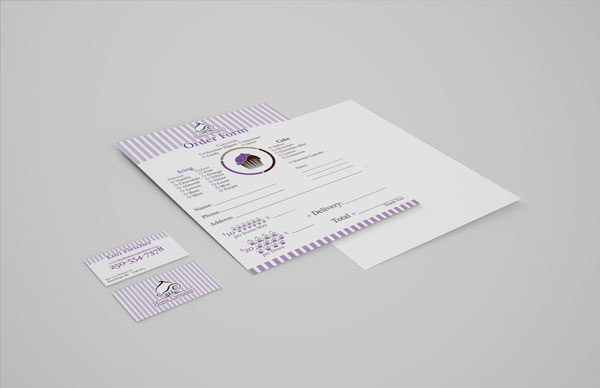
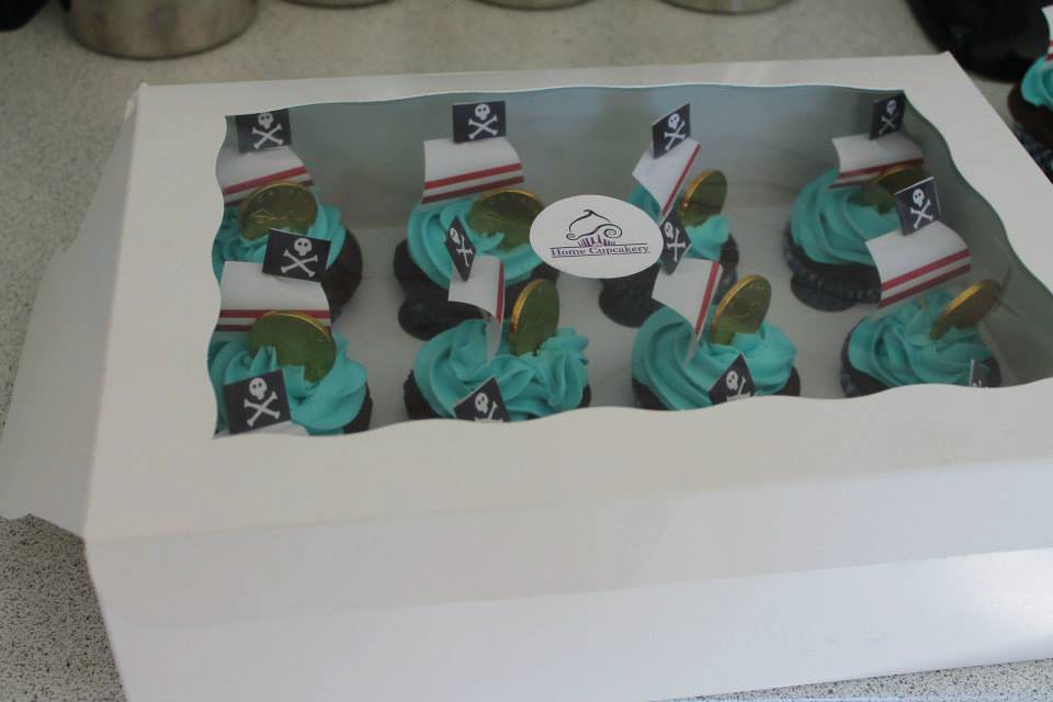
The branding of the Home Cupcakery is based on the classic bakery shops, hence the stripes used in some of the backgrounds, the curcular image an dthe line of serif text runing through the image. However it has a modern look with the bold colors and soft flowing lines. Placing this on a lot of white space gives it a clean open and fresh look. The cupcakes themselves contrast this with dark and bright colors of icing making it stand out. the balance in soft and hard was the most difficult to produce while creating it but it comes across sucessfuly in a strong brand mark that translates across mutipule mediums.


Visit the site here: